
How Seasonal Color Palettes Influence Consumer Buying Decisions
Quick Answer
Seasonal color palettes influence consumer buying decisions by making products feel timely, emotionally relevant, easier to style, and better suited to the season’s weather, occasions, and lifestyle needs. In fashion, color often works before the customer evaluates fabric, fit, or construction. It catches attention in a product grid, creates mood in a retail display, and helps the customer imagine when and where they would wear the item.
A seasonal palette does not automatically guarantee sales. Its commercial impact depends on customer profile, climate, product category, price point, cultural context, styling communication, and how well the colors work with existing wardrobe staples. A pale blue shirt may feel fresh and easy to buy in spring. A bright lime trouser may attract attention but require more styling confidence. A deep burgundy coat may feel emotionally right in autumn but less compelling in a tropical market.
For fashion businesses, seasonal color planning is not only a design exercise. It affects assortment architecture, merchandising, photography, buying depth, inventory risk, markdown exposure, and customer perception of value.

What Is a Seasonal Color Palette in Fashion?
A seasonal color palette is a coordinated group of colors selected for a specific selling season to guide product development, buying, styling, merchandising, and customer communication. In fashion, it usually includes core neutrals, seasonal update colors, accent shades, and sometimes one or two statement colors that define the visual mood of the collection.
The word “seasonal” can mean different things depending on the business model. For luxury and runway-led brands, seasonal palettes often follow Spring/Summer, Fall/Winter, resort, or pre-fall calendars. For mass retail, color planning may be divided into smaller monthly drops. For tropical markets, seasonality may be less about winter and summer, and more about Ramadan, holiday travel, back-to-school, wedding season, rainy season, or payday cycles.
This distinction is important. A seasonal palette should not be copied directly from a runway report without local editing. It needs to match real consumer behavior. In a hot climate, pale blue, white, teal, soft green, and lightweight neutrals may feel more wearable for daytime purchases. In a colder market, deeper brown, burgundy, charcoal, navy, forest green, or warm camel may support outerwear, knitwear, and layering.
The role of a seasonal palette is to create visual coherence. It helps customers understand the collection faster and helps retail teams build stories that feel intentional instead of random.
Why Color Affects Buying Decisions Before Fit or Fabric
Color affects buying decisions early because it is one of the first product signals customers notice. Before someone reads a product description, touches the fabric, checks measurements, or compares prices, they usually respond to the visual impression of the garment.
This does not mean color is more important than fit or quality. A beautiful color cannot save a badly constructed garment. But color can decide whether the customer stops scrolling, walks toward a rack, clicks a product image, or imagines the garment in their wardrobe.
In fashion retail, color influences several early decision points:
- Attention: strong or fresh colors can make a product stand out in a crowded product grid or store display.
- Mood: colors suggest softness, energy, warmth, calm, confidence, elegance, or playfulness.
- Occasion: certain colors feel more aligned with workwear, holidays, weddings, travel, eveningwear, or daily casual use.
- Seasonal relevance: customers often associate certain colors with climate, festivals, or seasonal transitions.
- Wardrobe fit: a color feels easier to buy when the customer can imagine pairing it with items they already own.
The business implication is clear: color is not decoration. It is a decision trigger. When the palette is clear, customers need less effort to understand the collection. When the palette is confusing, even good products can feel difficult to place.
The Link Between Season, Weather, and Color Preference
Seasonal color decisions are partly shaped by weather, because weather changes what consumers want clothing to feel like. A 2025 study based on more than 3.18 million transactions across 99 physical fashion retail stores in Italy found that higher temperature and relative humidity were associated with stronger preference for cooler clothing colors, while increased wind speed encouraged warmer color selection. The same study also found that fashion trends moderated the relationship between weather and color preference. Journal of Retailing and Consumer Services weather and color preference study
This does not mean all customers in hot weather automatically buy blue or green. Climate interacts with culture, lifestyle, product category, fabric, and trend exposure. Still, the study supports something many merchandisers observe in practice: color preference is not fixed across the year.
A white linen shirt may feel crisp in summer but less appealing in a rainy season. A chocolate brown knit dress may feel rich in autumn but too heavy in a humid resort assortment. A cool teal blouse may look refreshing during warm months, while a rust coat may feel emotionally right when customers are thinking about layering.
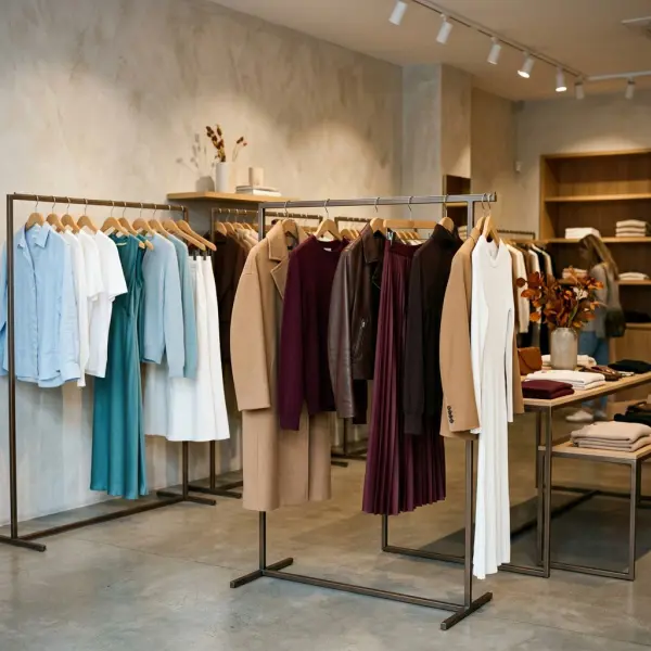
For global fashion brands, this means seasonal palettes should be flexible. A Northern Hemisphere Fall/Winter palette may not translate directly into Southeast Asian, Middle Eastern, or tropical retail calendars. The same color direction may need a lighter fabric, different styling, or a different launch window.
Seasonal Palettes Create Emotional Timing
Seasonal color palettes work because they align product emotion with customer timing. Consumers do not buy only because a color is attractive. They buy when the color feels right for a moment they are entering.
Spring palettes often suggest freshness, renewal, softness, and lightness. Summer palettes may emphasize brightness, clarity, travel, resort mood, or relaxed ease. Autumn palettes often bring depth, comfort, warmth, and groundedness. Winter palettes may lean into contrast, richness, shine, occasionwear, and stronger neutrals.
These associations are not universal rules, but they are commercially useful when handled with nuance. A pale pink blouse may feel romantic in one market, youthful in another, and too delicate in another. A deep red dress may feel festive, formal, bold, or culturally specific depending on region and occasion.
For fashion retailers, emotional timing affects both product planning and communication. A customer may not need another shirt, but they may want a color that makes their wardrobe feel ready for a new season, trip, work phase, celebration, or lifestyle shift.
How Seasonal Colors Influence Perceived Value
Seasonal colors can influence perceived value because they change how current, premium, versatile, or occasion-ready a garment appears. Two garments with the same pattern, material, and construction can feel very different when one is offered in a tired color and the other in a refined seasonal shade.
Perceived value is not only about price. It is about whether the customer believes the item deserves a place in their wardrobe now. A soft white blazer may feel more expensive than a harsh white blazer if the fabric and styling support the shade. A muted sage dress may look more wearable than a neon green dress for an everyday customer. A deep burgundy bag may feel more seasonal than a basic black bag during holiday gifting.
In a tougher fashion market, this matters even more. The Business of Fashion and McKinsey’s State of Fashion 2026 report notes that the global fashion industry is expected to face continued macroeconomic pressure and value-conscious consumer behavior. The State of Fashion 2026 by McKinsey and The Business of Fashion
When consumers become more selective, color must do more than look trendy. It must help the product feel useful, desirable, and worth buying.
The Difference Between Seasonal Palette, Trend Color, and Core Color
A seasonal palette is broader than a single trend color. It is the complete color system that organizes a collection for a selling period. A trend color may be one standout shade inside that system. A core color is the stable shade that supports repeat buying and wardrobe continuity.
|
Color Concept |
Meaning |
Consumer Buying Effect |
Business Use |
|
Seasonal palette |
Coordinated color story for a selling season |
Makes the collection feel timely and easy to understand |
Assortment planning, merchandising, campaign direction |
|
Trend color |
A color gaining visibility in fashion or lifestyle culture |
Creates novelty and attention |
Hero pieces, capsules, product refreshes |
|
Core color |
Reliable recurring color used across seasons |
Reduces buying hesitation through familiarity |
Best-sellers, basics, replenishment styles |
|
Accent color |
Small dose of color used for styling energy |
Encourages add-on purchases and outfit completion |
Accessories, trims, small products, styling content |
The problem comes when brands treat a trend color as if it were a core color. A bright seasonal shade may be perfect for a small blouse drop, but risky as the main color for trousers, coats, or high-volume inventory. The more visible and expensive the garment, the more carefully the color choice needs to be tested.
This article focuses on buying behavior. For a more customer-facing styling explanation, see fashion color trends explained for everyday styling.
How Seasonal Palettes Guide Retail Merchandising
Seasonal palettes help retail teams build clearer product stories. When colors are coordinated, a rack, window display, website category page, or email campaign becomes easier for customers to read.
A strong seasonal color story usually contains enough contrast to attract attention and enough harmony to make products feel connected. A spring display might combine soft white, pale blue, butter yellow, and denim. A fall display might combine chocolate brown, olive, cream, rust, and charcoal. A holiday display might use black, ivory, metallic accents, deep red, or jewel tones.
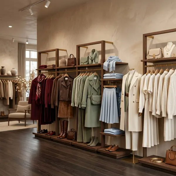
This kind of merchandising affects buying decisions because it reduces cognitive effort. Customers do not have to build every outfit from scratch. They can see which blouse goes with which trouser, which bag completes the look, and which color story matches their mood.
For e-commerce, the same principle applies to category pages and product photography. A color palette can make a product grid look more curated, which can improve perceived brand quality even before the customer clicks into a product page. For deeper retail execution, this connects with visual merchandising strategies for fashion retail.
How Seasonal Palettes Affect Assortment Planning
Seasonal color planning directly affects assortment structure. A buyer or brand owner must decide not only which colors are beautiful, but which colors deserve depth, which should be tested lightly, and which should remain editorial only.
A practical assortment usually separates colors into three buying levels:
- Depth colors: shades with high commercial confidence, usually core neutrals or proven seasonal colors.
- Breadth colors: colors used across selected categories to create freshness without overexposure.
- Test colors: stronger or more uncertain shades used in limited quantities.
For example, a brand may buy cream and navy deeply because they support multiple categories. It may use teal across blouses, dresses, and accessories as a seasonal update. It may test lime or vivid purple only in accessories or online-exclusive tops.
This structure helps manage markdown risk. A color that attracts clicks may not always convert into purchases at scale. Buying depth should be based on customer history, category logic, climate, price point, and styling confidence—not only visual excitement.
Product Category Changes the Buying Risk of Color
The same seasonal color can carry different buying risk depending on product category. A bold color in a scarf is a small commitment. The same color in a tailored suit is a much bigger decision.
|
Product Category |
Color Risk Level |
Why It Matters |
|
Accessories |
Low to medium |
Customers can test seasonal colors without changing their whole wardrobe |
|
Tops and blouses |
Medium |
Easy to refresh outfits, but must suit skin tone and styling habits |
|
Dresses |
Medium to high |
Color covers more visual area and strongly defines the occasion |
|
Trousers and skirts |
Medium to high |
Customers need more coordination confidence |
|
Outerwear |
High |
Higher price and visibility make color decisions more cautious |
|
Basics |
Low for core colors, high for unusual trend colors |
Repeat buying depends on easy wearability |
This is why a seasonal palette should not be applied evenly across all garments. A bright coral may work beautifully as a blouse, bag, or summer dress, but perform poorly as a high-volume trouser. A pale neutral may work well for shirts and dresses but require stronger quality control in lining, opacity, and stain resistance.
Color buying is category buying. Treating every shade the same across the collection is a common merchandising mistake.
The Role of Color Psychology in Purchase Decisions
Color psychology can help explain purchase behavior, but it should not be treated as a universal formula. Color associations vary across cultures, demographics, personal experience, religion, occasion, and social context.
Some broad associations may be familiar: blue can suggest calm, red can suggest energy, black can suggest formality, white can suggest freshness, and green can suggest nature or balance. But these meanings are not fixed. Red may suggest celebration in one context, danger in another, and power in another. White may suggest purity, minimalism, mourning, or practicality depending on region and occasion.
A 2025 paper on color and consumer buying behavior in UK fashion concluded that color can affect product perception, emotional response, impulse buying, and purchasing decisions, while also emphasizing the role of psychological and emotional associations. color and consumer buying behaviour in UK fashion paper
For fashion businesses, the practical lesson is not “red sells” or “blue calms.” The lesson is to understand how specific colors operate inside a specific customer context. Color psychology is useful when it is combined with sales data, product category, local culture, styling content, and real customer feedback.
How Online Shopping Changes the Role of Seasonal Color
In e-commerce, color often carries even more weight because customers cannot touch the product before buying. They rely on images, color names, styling photos, videos, and reviews to decide whether the color matches their expectation.
This creates several challenges. Product colors may look different across screens. Studio lighting may make a color appear cleaner or brighter than it is. A color name may create the wrong expectation. “Ivory,” “cream,” “bone,” “vanilla,” and “soft white” may sound similar but appear different to customers. If the delivered garment does not match the perceived color, returns and dissatisfaction can increase.
Online fashion brands should treat seasonal color communication carefully:
- Show the color on a model and in close-up fabric detail.
- Include realistic lighting, not only heavily edited campaign images.
- Use consistent color names across product categories.
- Add styling images with common wardrobe colors.
- Mention if the color is sheer, delicate, bright, muted, warm, or cool.
- Avoid over-filtered images that distort the actual shade.
This is also relevant for AI-assisted shopping and visual search. Clear product images, accurate descriptions, and consistent color terminology help both customers and search systems interpret the product correctly.

Cultural Context: Why Seasonal Palettes Need Local Editing
Seasonal color palettes are never culturally neutral. A palette that feels fresh, festive, luxurious, modest, romantic, youthful, or professional in one market may carry a different meaning somewhere else.
This is especially important for international fashion businesses. A white-heavy summer collection may work well in resortwear, but white may also carry ceremonial meanings in some contexts. Red may be powerful for partywear and festive dressing, but its meaning can vary widely by culture. Black may be elegant in one market and too formal or heavy in another. Pastels may feel romantic, modest, youthful, or premium depending on styling and category.
Local editing does not mean rejecting global trends. It means translating them. A global teal direction may become a modest tunic, a work blouse, a resort dress, or an accessory depending on the market. A global bright yellow direction may become a small accent in one country and a full statement piece in another.
This is where local merchandising teams provide value. They understand climate, religious occasions, holidays, office norms, skin tone diversity, shopping channels, and price sensitivity. Forecasts provide direction; local context decides what can sell.
Seasonal Color Palettes and Inventory Risk
Color can create demand, but it can also create dead stock. Seasonal colors are time-sensitive. If a color is too tied to a particular mood, event, or weather window, its selling period may be short.
A pastel spring dress may become harder to sell after the season passes. A holiday red satin top may lose urgency after the festive period. A winter coat in a strong trend color may be difficult to clear if the season is warmer than expected or if the color does not match customer taste.
Brands can manage color-related inventory risk through better planning:
- Keep high-volume production in proven colors.
- Use trend colors in categories with faster sell-through potential.
- Test uncertain colors through small batches or digital-first drops.
- Build palette bridges so colors can transition across seasons.
- Monitor early sell-through by color, not only by style.
- Prepare styling content to extend color relevance after launch.
The key is to separate creative excitement from buying depth. A color can deserve visibility without deserving large inventory commitment.
How Brands Can Apply Seasonal Palettes Strategically
Fashion businesses can use seasonal palettes more effectively by connecting color decisions to product planning, merchandising, and customer communication. The strongest color strategies are not built at the end of design. They are built early, then tested across the full commercial journey.
Start With Customer Reality, Not Only Trend Reports
Trend reports can be useful, but customer reality should shape the final palette. A brand selling professional workwear should not interpret seasonal color the same way as a resortwear label, streetwear brand, bridal studio, modest fashion business, or children’s apparel retailer.
Customer reality includes lifestyle, climate, shopping occasion, price sensitivity, wardrobe habits, and color confidence. A customer who buys wardrobe staples may prefer seasonal updates in soft, versatile shades. A customer buying statement fashion may respond better to bolder color stories.
Build a Palette Architecture
A seasonal palette should include roles, not just colors. Every color needs a job.
A useful palette architecture may include:
- Base neutrals for continuity and outfit building.
- Seasonal neutrals to make the collection feel updated.
- Soft colors for approachable freshness.
- Statement colors for attention and campaign impact.
- Accent colors for accessories, trims, or styling energy.
This gives the collection both commercial stability and visual freshness. It also helps avoid the common mistake of selecting attractive colors that do not work together.
Test Color in Real Product Conditions
Color should be reviewed in actual materials, not only digital palettes. A seasonal shade may shift dramatically depending on fabric type, surface texture, dye method, lining, print scale, and lighting.
Before approval, teams should evaluate lab dips, sample garments, product photography, and store lighting. For e-commerce, they should also check how the color appears on mobile screens because many fashion purchases begin there.

Use Styling Content to Reduce Buying Hesitation
Many customers hesitate because they like a color but do not know how to wear it. Styling content solves that problem. Product pages, reels, lookbooks, email campaigns, and store displays should show how seasonal colors pair with familiar wardrobe items.
A bright teal blouse becomes easier to buy when shown with navy trousers. A yellow bag becomes less intimidating when styled with white denim and a grey shirt. A burgundy dress becomes more versatile when shown for work, dinner, and festive occasions.
For brands building broader visibility, this also supports how fashion businesses can build online visibility in the age of ai search, because clear styling context makes product content more useful for both humans and AI-driven discovery.
Common Mistakes Brands Make With Seasonal Color Palettes
Seasonal color mistakes are often not design mistakes. They are translation mistakes. The color may be beautiful, but the brand fails to translate it into a commercially realistic product plan.
Mistake 1: Building the Palette Too Late
Some brands choose colors after silhouettes and fabrics are already fixed. This limits flexibility and can create weak color-material matches. A soft pastel may not work in a thin fabric. A deep jewel tone may need richer texture. A bright shade may need cleaner construction.
Better practice is to develop color, fabric, and product category together. A color should be judged by how it behaves in the final garment, not only by how it looks in a palette board.
Mistake 2: Ignoring Color Sell-Through Data
Many brands track style performance but do not analyze color performance deeply enough. A dress may sell well in black but poorly in lime. A blouse may sell slowly overall, but one color may have strong conversion. Without color-level analysis, brands may repeat the wrong shade or abandon a style that only needed a better color strategy.
Color sell-through, return rate, size availability, and markdown data should be reviewed together. A color that sells only after discount may be visually attractive but commercially weak at full price.
Mistake 3: Overusing Statement Colors
Statement colors help campaigns, but too many of them can make a collection difficult to shop. Customers need anchors. If every item competes for attention, the collection may look energetic but hard to wear.
A better approach is to let one or two statement colors lead the season, then support them with neutrals and softer companion shades.
Mistake 4: Forgetting the Customer’s Existing Wardrobe
A seasonal palette should help customers extend their wardrobes, not force them to start over. If the customer cannot imagine how the new color works with denim, black, cream, brown, navy, grey, or white, the buying decision becomes harder.
Styling guidance should make color adoption feel simple. The clearer the outfit logic, the lower the hesitation.
Mistake 5: Applying One Global Palette Everywhere
Global consistency can strengthen brand identity, but local markets may need different color emphasis. A color that works for winter outerwear in Europe may need a lighter interpretation for Southeast Asia. A festive palette may need different timing across regions.
The strongest global brands often maintain a broad color direction while adjusting product category, fabric, styling, and depth by market.
What Brands Should Verify Before Finalizing a Seasonal Palette
Before finalizing a seasonal palette, fashion businesses should verify both creative and commercial fit. A palette must look good, but it must also work in production, merchandising, and customer decision-making.
Key verification points include:
- Does the palette match the target customer’s lifestyle and color confidence?
- Does it suit the climate, selling period, and local occasion calendar?
- Are core colors strong enough to support trend colors?
- Which colors deserve production depth, and which should remain limited?
- Do colors work across fabric types and garment categories?
- Will the colors photograph accurately online?
- Can stores or e-commerce pages merchandise the colors clearly?
- Are color names consistent and understandable?
- Does the palette support styling content and cross-selling?
- What is the markdown plan if a seasonal color underperforms?
This checklist helps prevent a common problem: approving a beautiful palette that lacks commercial structure.
FAQ: Seasonal Color Palettes and Consumer Buying Decisions
How do seasonal color palettes influence what consumers buy?
Seasonal color palettes influence buying decisions by making products feel timely, emotionally relevant, and easier to imagine in specific situations. A customer may choose a pale blue shirt in spring because it feels fresh, or a burgundy dress in winter because it feels richer and more occasion-ready. Color can attract attention first, but the purchase still depends on fit, fabric, price, styling clarity, and whether the color feels wearable.
Are seasonal colors more important in physical retail or e-commerce?
They matter in both, but they work differently. In physical retail, seasonal color palettes shape windows, racks, outfit displays, and first impressions. In e-commerce, color affects product grid visibility, click-through, photography accuracy, and customer expectations. Online brands need especially careful color naming and imagery because customers cannot see the garment in person before buying.
Do trend colors always increase sales?
No. Trend colors can increase attention, but attention does not always become sales. A bright shade may perform well in campaign images but poorly in high-volume products if customers find it difficult to wear. Trend colors usually work best when matched to the right category, price point, fabric, and styling context. Small tests are safer than large production commitments for uncertain colors.
Why do some colors sell better in certain seasons?
Some colors align better with seasonal weather, occasions, and emotional expectations. Light, cool, and fresh shades may feel more appealing in warm months, while deeper, warmer, or richer shades may feel more suitable for cooler seasons. However, this varies by region. Tropical markets, religious holidays, wedding seasons, and local shopping habits can reshape seasonal color demand.
How many colors should a seasonal fashion palette include?
There is no universal number, but most practical palettes need a focused structure: several core neutrals, a few seasonal update colors, and one or two statement or accent colors. Too few colors can make a collection feel flat. Too many colors can weaken merchandising and increase inventory complexity. The right number depends on collection size, product category, and brand positioning.
How can small brands use seasonal palettes without overproducing?
Small brands can keep depth in proven core colors and test seasonal shades in limited runs, accessories, tops, or online capsules. They should monitor color-level sell-through early and avoid producing too much inventory in bold or untested shades. Styling content can also reduce hesitation by showing customers how to wear the new colors with familiar wardrobe pieces.
What is the difference between seasonal palette planning and color forecasting?
Seasonal palette planning selects colors for a specific collection or selling period. Color forecasting looks further ahead and tries to anticipate future color direction based on cultural, design, consumer, and market signals. Palette planning is more operational; forecasting is more strategic. Both are connected, but brands should not treat forecasts as automatic buying instructions.
Conclusion
Seasonal color palettes influence consumer buying decisions because they connect product, mood, timing, and wardrobe imagination. A well-planned palette makes a collection easier to understand and easier to buy. It helps customers see what feels fresh, what feels wearable, and what belongs in the current season.
For fashion businesses, the commercial value of seasonal color is strongest when color decisions are connected to product category, climate, customer habits, inventory depth, merchandising, and styling communication. A color that looks beautiful in a forecast is only useful if it can become a product customers want to wear, buy at the right price, and keep using beyond the first impression.
The best seasonal palettes do not simply follow trends. They translate color direction into buying confidence.




Comments 0
Leave a CommentSend Comment
Anda harus Login terlebih dahulu untuk dapat memberikan komentar.