
Visual Merchandising Strategies for Fashion Retail
Quick Answer
Visual merchandising strategies for fashion retail are planned methods for arranging, styling, lighting, displaying, and communicating fashion products so customers can understand the brand, notice key items, navigate the store or digital channel, and feel more confident about buying. It covers window displays, store layout, mannequins, product grouping, color stories, lighting, signage, fixtures, fitting-room support, digital product pages, and omnichannel presentation.
For fashion retailers, visual merchandising is not decoration. It is a commercial tool that translates assortment planning into a visible shopping experience. A strong display can make a collection feel desirable, but it also needs to be operationally realistic: products should be available in key sizes, easy to find, priced clearly, and supported by staff or product information.
The best visual merchandising strategy depends on the retailer’s brand position, store size, product category, customer behavior, season, stock depth, and channel mix. A premium boutique, activewear store, modest fashion retailer, denim shop, department store, and online-first apparel brand should not use the same visual formula.
What Is Visual Merchandising in Fashion Retail?
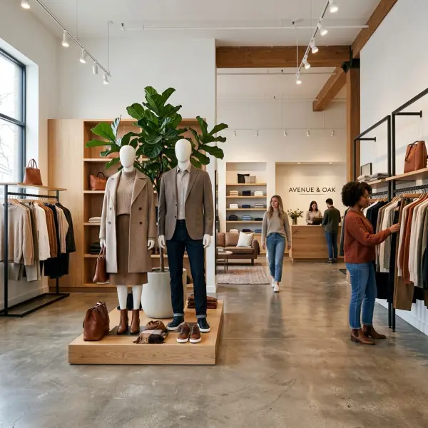
Visual merchandising in fashion retail is the practice of presenting apparel, accessories, and brand stories through layout, displays, styling, lighting, signage, fixtures, and digital visuals in order to guide customer attention and support buying decisions.
The word “visual” can make the work sound purely aesthetic, but in retail practice it is more precise than that. Visual merchandising decides what customers see first, how products are grouped, how outfits are interpreted, how price and quality are signaled, and how easy it feels to move from browsing to purchase.
A fashion retailer may have a strong product assortment, but if the store layout is confusing, the color story looks messy, mannequins show unavailable products, or online product images fail to explain fit, the customer experience weakens. Visual merchandising is where product planning becomes visible.
This article focuses on execution strategies: store display, layout, styling, lighting, signage, and digital presentation. For the broader commercial foundation behind product mix, pricing, inventory, and assortment planning, see fashion merchandising explained for retail businesses. For the behavioral side of how merchandising affects attention, choice, value perception, and confidence, see how merchandising influences consumer buying decisions.
Why Visual Merchandising Matters for Fashion Retailers
Visual merchandising matters because fashion products need context. A customer does not only ask, “What is this?” They also ask, “Can I wear this?”, “What does it go with?”, “Is it worth the price?”, “Does it fit my lifestyle?”, and “Does this brand understand me?”
Shopify describes visual merchandising as the way retailers use displays, layouts, and presentation techniques to attract customers and encourage product discovery. visual merchandising in retail In fashion, the effect is especially important because apparel is tied to identity, body confidence, occasion, fit, styling, and social context.
A plain black blazer can look ordinary on a crowded rack. Styled on a mannequin with tailored trousers, a silk blouse, a belt, and low heels, it becomes a workwear story. A printed scarf may seem like an accessory add-on. Placed beside a neutral dress, it becomes the visual detail that completes the outfit.
That is the practical power of visual merchandising. It helps customers imagine use.
It can also expose operational weaknesses. If a store creates a beautiful front display but cannot support it with available sizes, enough stock, clear pricing, or trained staff, the display may generate interest without conversion. Good visual merchandising must therefore be connected to inventory, product knowledge, and sales operations.
Start With a Clear Visual Merchandising Objective
The first strategy is to define what the display or layout is supposed to achieve. Many weak retail displays fail because they try to do everything at once: show new arrivals, promote discounts, feature bestsellers, create brand mood, clear old stock, and explain a seasonal story in the same space.
A visual merchandising objective should be specific enough to guide decisions. A window display may be designed to attract foot traffic. A front-table display may introduce a new collection. A mannequin group may explain styling. A wall fixture may organize denim fits. A checkout area may support small add-on accessories.
Common visual merchandising objectives include:
- Introduce a new seasonal collection.
- Highlight one hero product or product category.
- Show customers how to style a difficult item.
- Support a promotional campaign without making the store look cheap.
- Increase accessory attachment through complete looks.
- Make a premium product feel more valuable.
- Help customers navigate sizes, fits, or product categories.
- Clear seasonal inventory while protecting brand perception.
The objective affects everything that follows: product selection, display position, styling, fixture choice, lighting, signage, and replenishment. Without a clear objective, the store may look busy rather than persuasive.
Use Store Layout to Guide Customer Flow
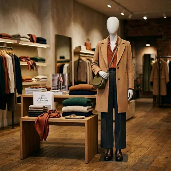
Store layout affects how customers move, what they notice, how long they stay, and whether product categories feel easy to understand. In fashion retail, layout should support both discovery and decision-making.
A small boutique may need an open layout with clear sightlines so the store feels spacious. A denim store may need category walls organized by fit, wash, and size. A premium fashion store may use more spacing to signal quality and allow garments to breathe. A high-volume value retailer may use denser fixtures but still needs logical pathways and visible category zones.
Shopify’s retail store layout guide discusses common formats such as grid, loop, free-flow, and boutique-style layouts, with layout choice depending on store size, product type, and shopping behavior. retail store layout ideas
For fashion retailers, the layout should answer three practical questions:
- Where should the customer naturally go first?
- Which products need visibility because they define the current story?
- Which areas need clarity because customers must compare options, sizes, or fits?
A store selling occasionwear, for example, may benefit from a layout that moves customers from inspiration to selection to fitting-room support. A casualwear store may need faster browsing, clear size access, and coordinated add-ons. An accessories-heavy store may rely on product density, but still needs visual hierarchy so customers are not overwhelmed.
The layout should also reflect operational reality. A beautiful fixture that is hard to replenish will eventually look weak. A product wall that requires constant folding may become messy during peak traffic. Visual merchandising is not only what the store looks like at opening hour. It is what the store can maintain through a real selling day.
Build a Strong Visual Hierarchy
Visual hierarchy means arranging visual elements so customers understand what matters first, second, and third. It is a useful concept in both store design and digital merchandising.
Nielsen Norman Group explains visual hierarchy as the use of factors such as scale, contrast, color, spacing, and grouping to guide attention toward important elements. visual hierarchy in UX In fashion retail, the same principle applies to a store wall, window display, product page, or homepage edit.
A display without hierarchy can feel like noise. Every item competes for attention. Customers may browse, but they do not know where to begin.
A stronger approach uses hierarchy intentionally:
|
Visual Element |
Retail Purpose |
Fashion Example |
|
Hero item |
Captures first attention |
A styled trench coat at the entrance |
|
Supporting products |
Complete the story |
Knit top, trousers, bag, belt |
|
Product depth |
Shows availability |
Nearby rack with sizes and colors |
|
Signage or copy |
Clarifies the message |
“Light layers for weekday dressing” |
|
Add-on detail |
Encourages basket building |
Scarf, brooch, socks, hair accessory |
The hierarchy should not be too rigid. Fashion retail needs a sense of discovery. But customers should not have to decode the store by themselves. The display should gently tell them: start here, understand this, then explore.
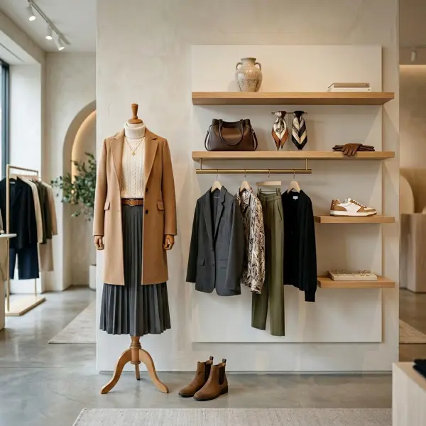
Merchandise Outfits, Not Just Individual Products
Fashion customers often need styling context before they feel ready to buy. This is why outfit-based merchandising remains one of the most effective strategies in apparel retail.
A rack of separate garments asks customers to do the styling work. A complete outfit gives them a starting point. It helps them understand proportion, color combination, layering, occasion, and price justification. It can also increase basket size when the styling feels realistic and easy to replicate.
This does not mean every product must be styled as a full editorial look. The goal is to show usable combinations. A cropped jacket may need a high-waisted trouser. A sheer blouse may need an inner layer. A midi skirt may sell better when customers see the right shoe proportion. A bold printed top may feel easier to wear when styled with simple denim or tailored black pants.
Outfit-based merchandising works especially well for:
- New collections that need a clear seasonal story.
- Products that customers may find difficult to style.
- Higher-priced items that need value justification.
- Accessories that feel optional when displayed alone.
- Capsule wardrobes or coordinated sets.
- Occasionwear, workwear, modest fashion, resortwear, and travelwear.
The risk is over-styling. If the outfit feels too theatrical for the target customer, it may create admiration without purchase. A premium boutique can be aspirational, but the customer still needs to believe: I can wear this.
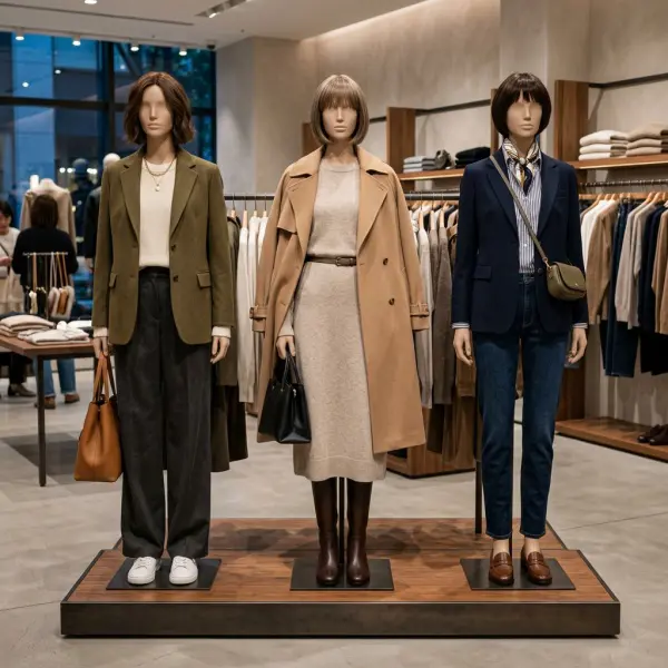
Use Mannequins as Commercial Storytelling Tools
Mannequins are not only display props. In fashion retail, they can explain fit, proportion, layering, styling, and occasion faster than a product description.
Shopify’s 2026 mannequin guide emphasizes using mannequins to tell a brand story, reduce customer overwhelm, and support conversion through clearer styling. mannequin display guide
For apparel retailers, mannequins are especially valuable when products need body context. A jacket’s shoulder line, trouser width, dress length, sleeve shape, and layering proportions are easier to understand when shown on a form. For accessories, mannequins can show how bags, scarves, belts, jewelry, hats, and shoes complete the outfit.
A good mannequin strategy should consider:
- Product availability: displayed items should be in stock or clearly substituted.
- Customer relevance: styling should match the store’s real buyer, not only the creative team’s taste.
- Proportion: garment length, layering, and silhouette should be clear.
- Category support: mannequins should lead customers to nearby stock.
- Maintenance: outfits should be refreshed often enough to avoid looking stale.
A mannequin can create desire, but the surrounding merchandising must complete the sale. If customers cannot find the item, size, price, or styling alternatives, the display becomes inspiration without a clear buying path.
Create Color Stories That Support the Brand and Season
Color is one of the fastest visual signals in fashion retail. It can make a store feel calm, energetic, premium, youthful, romantic, minimal, festive, or trend-driven. But color merchandising must be planned carefully because visual impact and commercial performance are not always the same.
A strong color story should connect brand identity, season, customer preference, and available stock. A neutral palette may suit a premium workwear brand. A bright color wall may fit a youth-focused resort collection. A tonal display of beige, cream, and soft brown may make a small boutique feel curated. A contrast display of red, black, and metallic accessories may work for holiday selling.
Color blocking can help customers scan the store quickly. Tonal merchandising can create a premium, edited look. Mixed-color outfit stories can help customers understand styling combinations. None of these is universally better. The right strategy depends on the product and the customer.
The commercial caveat is important: do not let color create a false story. If the front display is built around a color with limited sizes or weak sell-through, the store may look appealing but underperform. Color should attract attention, but it should also align with stock depth and customer demand.
Use Lighting to Shape Mood, Detail, and Product Perception
Lighting affects how customers perceive color, texture, quality, and atmosphere. In fashion retail, poor lighting can make fabric look dull, fitting rooms unflattering, and displays less visible. Good lighting can highlight hero products, show material detail, and create a store mood that matches the brand.
Lighting strategy usually involves several layers:
- Ambient lighting: the overall brightness of the store.
- Accent lighting: focused light on displays, mannequins, or hero products.
- Task lighting: practical lighting for fitting rooms, checkout, or service areas.
- Decorative lighting: brand atmosphere, usually secondary to product visibility.
Fashion retailers should be careful with lighting that looks dramatic but distorts product color. This is especially risky for online returns if customers buy in-store lighting conditions that do not match daylight perception, or if product photography uses color treatment that makes items look different from real life.
Fitting-room lighting deserves special attention. A customer may love a garment on the rack but reject it under harsh overhead lighting. Softer, balanced lighting can make the fitting experience more accurate and more comfortable, but it should still represent the garment honestly.
Make Signage Useful, Not Decorative Noise
Signage should help customers understand the store. It should not fight with the product.
In fashion retail, useful signage may clarify collection names, size zones, fit types, price promotions, material stories, care information, styling edits, or navigation. Weak signage often repeats generic claims, overuses promotional language, or adds visual clutter without helping the customer decide.
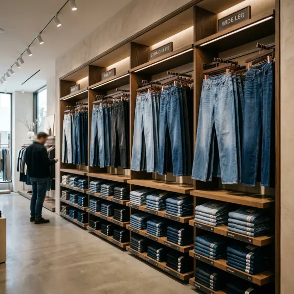
A denim wall, for example, may need clear fit labels: straight, slim, wide-leg, flare, cropped, high-rise. A modest fashion store may need sections by occasion or layering need. A premium tailoring store may use subtle signage for fabric quality, made-to-order options, or alteration support.
The best signage is usually brief, specific, and placed close to the decision point. A beautiful message at the entrance may create mood, but a clear fit label beside the product can help close the decision.
Design Fitting Rooms as Part of Visual Merchandising
Fitting rooms are often treated as back-of-store utilities. For fashion retail, that is a mistake. The fitting room is where many buying decisions become final.
A fitting room should support confidence. Lighting, mirrors, hooks, seating, privacy, cleanliness, size exchange support, staff access, and styling suggestions all affect the experience. If the fitting room feels cramped, poorly lit, or inconvenient, customers may reject products faster or avoid trying additional items.
For apparel retailers, fitting-room merchandising can include:
- Nearby add-on products such as belts, camisoles, or shaping accessories.
- Clear staff support for size exchanges.
- Mirrors that show proportion accurately.
- Hooks labeled by decision stage, such as “maybe” and “yes,” if appropriate for the brand.
- Styling cards or subtle outfit suggestions.
- Clean space for customers to place personal items.
This is not only about comfort. It is about reducing friction at the most sensitive point of the fashion purchase: the moment the customer sees the product on their own body.
Extend Visual Merchandising to E-Commerce
Digital visual merchandising is the online version of store presentation. It includes product images, thumbnails, category pages, homepage edits, sorting logic, filters, lookbooks, styling modules, video, size presentation, and product page hierarchy.
Baymard’s product page UX research notes that many e-commerce product pages still perform poorly or only moderately on user experience, and specifically highlights the importance of showing apparel and accessory products on a human model. product page UX research
For fashion e-commerce, visual merchandising should help customers understand scale, fit, fabric, and styling. A flat lay can be beautiful, but it may not show drape. A model image can show proportion, but it may not show fabric detail. A close-up image can show texture, but it does not explain the full silhouette.
A stronger apparel product page often includes:
- Front, back, side, and detail images.
- Model height and size worn.
- Close-up view of fabric texture or finishing.
- Styling images showing at least one realistic outfit.
- Clear thumbnails that distinguish similar colors.
- Product page hierarchy that keeps size, price, material, and shipping information easy to find.
Digital visual merchandising should also be consistent with physical merchandising. If a campaign image shows a full outfit, the online store should help customers shop the full look. If an in-store display uses a seasonal color story, the website and email edits should echo that story without forcing customers to hunt for the products.

Connect Visual Merchandising With Inventory Reality
One of the most overlooked parts of visual merchandising is stock alignment. A display may look strong, but if the hero item is nearly sold out, unavailable in key sizes, or difficult to replenish, the visual strategy can frustrate customers.
Visual merchandising should be planned with inventory data. A front display needs enough depth to support demand. A mannequin outfit should lead to available products. A promotional table should not be built around scattered leftovers unless the objective is clearly clearance. A window display should not feature a product that only exists in one odd size.
This is where visual merchandising connects back to the wider merchandising system. Product planning, stock allocation, and display planning should not operate separately.
A practical weekly check can help:
|
Display Area |
Stock Question |
Operational Action |
|
Window display |
Are hero products still available in key sizes? |
Refresh or substitute before customer frustration rises |
|
Front table |
Is the product depth enough for traffic? |
Replenish frequently or reduce display scale |
|
Mannequins |
Can shoppers find the full outfit nearby? |
Place stock close to the display |
|
Sale area |
Is markdown stock organized clearly? |
Group by size, category, or price |
|
Online homepage |
Are featured items available? |
Remove sold-out products quickly |
The stronger the visibility, the more important the stock check. High attention without availability creates a broken customer experience.
Adapt Visual Merchandising by Retail Format
Visual merchandising should change by retail format. A single formula will not work across all fashion businesses.
|
Retail Format |
Visual Merchandising Priority |
Practical Strategy |
|
Small boutique |
Curated story and space efficiency |
Use edited displays, clear outfit stories, and flexible fixtures |
|
Department store |
Navigation and category clarity |
Use strong signage, brand zones, and clear product hierarchy |
|
Premium fashion store |
Quality, spacing, and atmosphere |
Use fewer products, better lighting, and refined styling |
|
Fast fashion store |
Newness and speed |
Refresh displays frequently and keep category flow simple |
|
Denim store |
Fit comparison |
Organize by fit, wash, rise, stretch, and size |
|
Modest fashion retailer |
Layering and occasion clarity |
Show inner layers, outer layers, scarves, and full looks |
|
E-commerce apparel brand |
Product confidence |
Use model images, detail shots, size guidance, and shop-the-look modules |
|
Pop-up store |
Immediate message clarity |
Focus on a limited hero story and fast navigation |
The main principle is relevance. A luxury-style sparse display may not work for a value retailer that depends on volume and fast choice. A dense promotional layout may damage a premium brand that relies on material quality and calm service. Visual merchandising should support the business model, not imitate another retailer’s aesthetic.
How Fashion Businesses Can Apply Visual Merchandising Strategically
Fashion businesses can apply visual merchandising more effectively by treating it as a repeatable system rather than an occasional display refresh. The system should connect brand story, product role, inventory depth, customer behavior, and channel execution.
Build a Monthly Visual Merchandising Calendar
A visual merchandising calendar helps teams plan displays around product drops, campaigns, seasons, cultural moments, holidays, local events, and markdown windows. It prevents last-minute display decisions and keeps the store visually fresh.
The calendar should include launch dates, window themes, key product stories, mannequin updates, signage needs, online homepage edits, email visuals, and stock checks. For small retailers, this can be a simple spreadsheet. The value comes from consistency, not complexity.
Create Display Rules for Key Product Categories
Different products need different display logic. Dresses may need full-body styling. Denim may need fit education. Accessories may need close placement near related outfits. Inner layers may need tactful visibility. Shoes may need enough spacing to show shape and material.
Simple display rules help store teams maintain standards without waiting for head-office direction. They also make training easier when staff changes.
Train Store Teams to Read the Display Commercially
Visual merchandising should not be separated from sales feedback. Store teams can often see which displays attract attention, which products customers touch but do not try, which outfits generate questions, and which signage is ignored.
A good visual merchandising review asks:
- Did customers stop at the display?
- Did they pick up the product?
- Did they ask for sizes?
- Did they try it on?
- Did they buy the full outfit or only one item?
- Did the display need too much maintenance?
- Did the product sell because of the display, or despite it?
This turns visual merchandising from a styling task into a retail learning process.
Keep Digital and Physical Stories Aligned
If the store window promotes “lightweight workwear,” the website should make the same edit easy to find. If Instagram shows a layered outfit, the product page should support “shop the look.” If a boutique display introduces a new color story, email and homepage visuals should reinforce it.
Customers often move between channels. A disconnected visual story creates friction. A connected story builds recognition.
Common Visual Merchandising Mistakes
Visual merchandising mistakes usually happen when the store prioritizes appearance over customer usability or stock reality.
Mistake 1: Creating Beautiful Displays That Are Hard to Shop
A display may photograph well but fail commercially if customers cannot locate the products, understand the price, or find their size. This often happens when retailers treat displays as decoration rather than sales support.
The better approach is to place shoppable stock near the display, keep the product story clear, and ensure staff know what is featured.
Mistake 2: Overcrowding the Store
Too many products in one area can make a store feel abundant, but it can also reduce product clarity. Customers may struggle to see what is new, what is important, and how items relate to one another.
The better approach is controlled density. High-volume stores may need more product on the floor, but even dense displays need category logic, color structure, and clear pathways.
Mistake 3: Letting Displays Go Stale
A display that stays unchanged for too long becomes invisible to regular customers. It can also make the store feel inactive, even when new stock exists.
The better approach is to refresh key displays according to traffic, product drops, season, and sell-through. Refreshing does not always require a full rebuild. Sometimes changing the hero product, color story, or mannequin styling is enough.
Mistake 4: Ignoring Fitting-Room Experience
A strong sales floor can lose the sale in the fitting room. Poor lighting, limited hooks, lack of staff support, or no size exchange process can weaken purchase confidence.
The better approach is to treat fitting rooms as decision spaces. They should be clean, supportive, well-lit, and connected to selling assistance.
Mistake 5: Copying Luxury Visual Codes Without Matching the Business Model
Some retailers imitate luxury spacing, minimal fixtures, or very sparse displays because they look premium. But if the brand depends on frequent browsing, broad sizing, or accessible pricing, too much emptiness may reduce product discovery.
The better approach is to adapt visual codes to the brand’s real customer and commercial model. Premium does not always mean sparse. Value does not have to mean chaotic.
What Visual Merchandising Cannot Fix
Visual merchandising can improve attention, clarity, perceived value, product storytelling, and the ease of shopping. But it cannot fully fix weak products, poor fit, unreliable quality, unrealistic pricing, missing sizes, or a mismatch between the brand and customer.
This matters because retailers sometimes blame the display when the product itself has a deeper issue. A dress may look strong on a mannequin but fail in the fitting room because the fabric clings awkwardly. A jacket may attract attention but lose conversion because the shoulder fit is too narrow. A premium display may elevate a bag visually, but if the material quality does not support the price, customers may still reject it.
Visual merchandising should therefore be measured alongside product, price, stock, and customer feedback. It is one part of the retail system. A powerful one, but not a substitute for good merchandising fundamentals.
FAQ: Visual Merchandising Strategies for Fashion Retail
What is the main goal of visual merchandising in fashion retail?
The main goal of visual merchandising is to make fashion products easier to notice, understand, desire, and buy. It uses layout, displays, styling, lighting, signage, fixtures, mannequins, and digital visuals to guide customer attention and communicate product value. In fashion retail, it also helps customers imagine how garments fit into real outfits, occasions, and lifestyles. The goal is not only to make the store attractive, but to support a clearer buying journey.
What are the most important visual merchandising strategies for a small fashion store?
For a small fashion store, the most important strategies are clear product grouping, strong hero displays, usable outfit styling, flexible fixtures, good lighting, and disciplined stock presentation. Small stores cannot rely on unlimited space, so every display needs a purpose. A boutique should avoid overcrowding and focus on curated stories that make the range feel intentional. It also needs regular display refreshes so repeat customers notice newness.
How often should fashion retailers change their displays?
Fashion retailers should change displays based on product drops, traffic, season, sell-through, and campaign timing. A high-traffic fast-fashion store may need frequent refreshes, while a premium boutique may refresh more selectively. The key is not changing for the sake of change. Displays should be updated when the product story, stock position, or customer attention needs to shift. Hero displays and mannequins usually need closer monitoring than lower-traffic areas.
Is visual merchandising only for physical stores?
No. Visual merchandising also applies to e-commerce, marketplaces, social commerce, and omnichannel retail. Online visual merchandising includes product images, category pages, homepage edits, filters, lookbooks, model photography, product videos, and shop-the-look modules. For apparel, digital presentation is especially important because customers cannot touch the fabric or try the garment before purchase. Strong online visuals help explain fit, scale, texture, styling, and product value.
How does lighting affect fashion merchandising?
Lighting affects how customers see color, texture, silhouette, quality, and store atmosphere. Accent lighting can highlight hero products, while fitting-room lighting can influence body confidence and purchase decisions. Poor lighting may distort fabric color, make garments look dull, or create an uncomfortable try-on experience. Fashion retailers should use lighting that supports mood while still showing products accurately.
What is the difference between merchandising and visual merchandising?
Merchandising covers the broader commercial system: product assortment, pricing, stock planning, allocation, timing, promotion, and performance review. Visual merchandising focuses on how products are physically or digitally presented through layout, styling, displays, lighting, signage, and visual hierarchy. The two should work together. A strong display needs good stock planning behind it, while a good assortment needs visual execution to help customers understand it.
Can visual merchandising increase sales?
Visual merchandising can support sales by improving product visibility, customer navigation, styling clarity, perceived value, and purchase confidence. But it does not guarantee sales by itself. Results depend on product relevance, pricing, stock availability, fit, quality, staff support, and customer demand. The strongest visual merchandising strategies are connected to inventory data, customer feedback, and broader retail planning.
Conclusion
Visual merchandising is where fashion retail becomes visible, tangible, and emotionally understandable. It turns product assortment into a shopping experience customers can navigate, interpret, and trust.
The strongest strategies are not built from aesthetics alone. They come from a practical connection between brand identity, customer behavior, product role, layout, lighting, signage, styling, stock reality, and digital presentation. A display should attract attention, but it should also help customers make decisions.
For fashion retailers, the real opportunity is to treat visual merchandising as a business discipline. A mannequin is not just a mannequin. A window is not just a window. A fitting room is not just a fitting room. Each one can either reduce friction or create it.
When visual merchandising is planned well, customers do not simply see more products. They understand the offer better, imagine outfits more easily, and move through the buying journey with more confidence.




Comments 0
Leave a CommentSend Comment
Anda harus Login terlebih dahulu untuk dapat memberikan komentar.