
Fashion Color Trends Explained for Everyday Styling
Quick Answer
Fashion color trends are the dominant colors, tones, and color combinations that appear across runway collections, retail assortments, street style, social media, lifestyle products, and consumer wardrobes during a certain period. For everyday styling, the goal is not to copy every trending shade. The goal is to translate color direction into wearable outfits that suit the customer’s lifestyle, climate, wardrobe base, skin undertone, product category, and brand identity.
In 2026, color direction is not moving in only one direction. Pantone’s Spring/Summer 2026 fashion color reporting points to a mix of expressive brights and grounded tones, including examples such as Alexandrite teal, Lava Falls red, White Onyx, and Sage Green. Pantone also named Cloud Dancer as its 2026 Color of the Year, while WGSN and Coloro named Transformative Teal as their 2026 color direction, showing that different forecasting authorities may emphasize different signals.
For fashion brands, color trends matter because color is one of the fastest ways to make familiar garments feel current. A basic shirt, dress, blazer, or knit top can become more relevant simply through a refreshed palette. The commercial challenge is choosing colors that look new without becoming too difficult to wear, produce, photograph, merchandise, or sell.
What Are Fashion Color Trends?
Fashion color trends are recurring color directions that influence how garments, accessories, prints, fabrics, retail displays, and outfit combinations are designed and styled for a specific season or market moment. In practical terms, they help fashion businesses decide which colors should appear as core shades, seasonal updates, statement accents, and limited-edition drops.
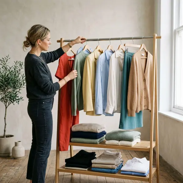
A color trend is not just one color becoming “popular.” It usually includes a broader visual mood. For example, a trend toward soft white, pale blue, and muted sage communicates freshness and calm. A trend toward tomato red, citrus yellow, turquoise, or purple communicates energy and visibility. A trend toward chocolate brown, stone, charcoal, or olive communicates groundedness and wardrobe stability.
This distinction matters in everyday styling. Consumers rarely buy a trend because a color institute or runway says so. They buy it when the color solves a wardrobe problem: it makes jeans feel new, softens formal workwear, adds energy to basics, photographs well online, or creates an outfit that feels current without looking forced.
For fashion businesses, color trends sit between creativity and inventory risk. A strong color can refresh a best-selling silhouette. The same color can also create markdown pressure if it is too difficult to style, too culturally specific, too close to last season’s stock, or poorly matched to the brand’s customer base.
Why Color Trends Matter in Everyday Styling
Color trends matter in everyday styling because they update familiar clothing without requiring a complete change in silhouette, material, or garment function. A white shirt remains a white shirt. A pair of trousers remains trousers. But when color direction shifts from stark white to creamy white, from black to chocolate brown, or from navy to teal, the styling message changes immediately.
This is why color is commercially powerful. It is visible on a rack, in a social media thumbnail, in a product grid, and in a retail window before the customer notices construction details. The Business of Fashion and McKinsey’s State of Fashion 2026 report notes that fashion businesses are operating in a challenging environment shaped by economic volatility, shifting consumer priorities, tariffs, and technological disruption, with value-conscious behavior becoming more important. In that kind of market, color can help refresh assortments without forcing brands to overcomplicate product development.
For everyday styling, color also works as a low-effort styling tool. A customer who does not want a dramatic silhouette can still participate in a trend through a scarf, blouse, sneaker, handbag, cardigan, belt, or nail color. This makes color trends especially useful for brands selling wearable apparel rather than runway-led statements.
A simple example: if teal, pale blue, or soft white is trending, a brand does not need to redesign its entire collection. It can introduce these tones through tops, knitwear, resort pieces, lightweight outerwear, or accessories. The customer can then pair them with denim, beige trousers, black skirts, or existing neutrals.
The Difference Between Trend Colors, Core Colors, and Accent Colors
Trend colors, core colors, and accent colors serve different roles in an everyday wardrobe. Confusing them is one of the fastest ways to create a collection that looks exciting on a mood board but performs poorly in real life.
Core colors are the dependable shades that customers use repeatedly: black, white, navy, beige, grey, denim blue, chocolate brown, olive, and other brand-specific neutrals. Trend colors are seasonal or emerging shades that make the collection feel current. Accent colors are smaller doses of color used to create energy, contrast, or personality.
|
Color Role |
What It Means |
Everyday Styling Use |
Business Risk |
|
Core color |
Reliable shade used across seasons |
Trousers, blazers, shirts, denim, basic dresses |
Low risk, but can feel repetitive |
|
Trend color |
Seasonal or culturally visible color direction |
Blouses, tops, dresses, knitwear, capsules |
Medium risk if poorly matched to customer taste |
|
Accent color |
Small but visible color pop |
Accessories, trims, shoes, bags, scarves |
Lower risk when used in controlled quantities |
|
Statement color |
Strong shade used as the main outfit focus |
Dresses, suits, occasionwear, campaign pieces |
Higher risk, but can create strong visual identity |
In everyday styling, most customers need a balance. A wardrobe made only of trend colors can become difficult to combine. A wardrobe made only of neutrals can feel safe but flat. The most practical styling direction usually starts with a stable base, then adds one or two updated colors.
For fashion brands, this becomes an assortment decision. Core colors protect continuity. Trend colors create freshness. Accent colors allow experimentation without overcommitting production volume.
How Current Color Trends Translate Into Wearable Outfits
Current fashion color direction shows two useful movements for everyday styling: expressive color and refined softness. These two directions can coexist in the same wardrobe, but they require different styling strategies.
Pantone’s Spring/Summer 2026 reporting highlights a mix of intense and softer colors, while Vogue’s 2026 color trend coverage pointed to bright spring tones such as tomato, lime, purple, turquoise, and yellow, alongside a notable soft neutral direction. That does not mean every customer should wear full lime green or full red. It means those colors are part of the visual conversation and can be translated in more wearable ways.
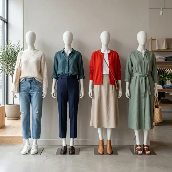
A customer who likes minimal dressing might wear Cloud Dancer white with relaxed denim and leather sandals. A more expressive dresser might wear tomato red with pale pink or brown. A workwear customer might use teal in a blouse under a navy blazer. A modest fashion customer might choose sage green or soft blue in a long tunic, skirt, or outer layer.
Soft White and Creamy Neutrals
Soft white, cream, ivory, and related pale neutrals are useful because they look fresh without feeling aggressive. Pantone’s 2026 Color of the Year, Cloud Dancer, sits in this family of light, airy neutral direction. For everyday styling, this kind of color works well in shirts, summer dresses, linen blends, cotton tops, lightweight tailoring, and knitwear.
The risk is maintenance. Very light garments can show stains, require better fabric opacity, and need careful photography so they do not look flat online. For brands, this means fabric weight, lining, finishing, and product images matter as much as the color itself.
Teal, Aqua, and Blue-Green Directions
Teal and aqua-based colors are useful because they sit between blue and green. They can feel calm, modern, coastal, technical, or premium depending on saturation and material. WGSN and Coloro’s 2026 Transformative Teal direction reflects this broader interest in blue-green tones.
For everyday styling, teal is easier than many bright colors because it pairs well with denim, white, cream, chocolate brown, navy, and grey. A teal blouse can refresh office trousers. A teal dress can feel polished without being overly formal. A teal accessory can bring color into a neutral wardrobe without looking too loud.
Tomato Red and Warm Statement Shades
Tomato red, lava red, and warm coral-red shades bring energy to simple outfits. They are especially effective in pieces with clean silhouettes: shirts, cardigans, simple dresses, knit tops, belts, bags, and shoes. A red garment with too many design details can quickly feel excessive; a red garment with a clean cut often feels sharper.
For everyday styling, red works best when the rest of the outfit gives it space. Red with denim is casual. Red with beige is polished. Red with pale pink feels fashion-forward. Red with black can look strong but may become too severe depending on fabric and styling.
Sage Green, Olive, and Grounded Nature Tones
Sage green and olive continue to be commercially useful because they behave almost like neutrals. They are softer than black, less formal than navy, and often easier to wear than saturated green. These shades work well in casual shirts, utility jackets, dresses, trousers, outerwear, and soft tailoring.
For brands selling everyday clothing, grounded greens can be a safer bridge into color. They offer freshness without demanding dramatic styling from the customer.
Pale Blue, Turquoise, and Clear Summer Shades
Blue remains one of the easiest color families to translate into daily wear because many consumers already own denim and navy. Pale blue can soften workwear. Turquoise can energize resortwear, swimwear, summer dresses, and casual tops. Azure and clear sky-blue tones photograph well, but brands should test them carefully across different fabrics because the same blue may look crisp in cotton poplin but flatter in thin jersey.
How to Use Color Trends Without Looking Overstyled
The easiest way to use color trends is to change the dose, not the entire wardrobe. Most everyday customers do not need a head-to-toe trend look. They need a practical entry point that feels natural with what they already own.
For consumers, the simplest method is to choose one trending color and connect it to existing wardrobe anchors. For brands, the same principle applies to styling guides, product pages, lookbooks, and retail displays. A trending color becomes more sellable when the customer can immediately see how to wear it.
Useful everyday styling formulas include:
- One trend color with two neutrals, such as teal with navy and white.
- One bright color with denim, such as tomato red with straight-leg jeans.
- One soft color family in tonal layers, such as cream, ivory, and beige.
- One colored accessory with a neutral outfit, such as a yellow bag with a grey dress.
- One color repeated twice, such as blue shoes and a blue shirt, to create intention without full matching.
The point is not to remove personality. The point is to reduce friction. When a customer can imagine wearing the outfit tomorrow, the trend becomes practical.
This connects naturally with seasonal color palettes influence consumer buying decisions, because color becomes commercially stronger when it fits the season, climate, retail channel, and customer occasion.
Why Fabric, Texture, and Finish Change How Color Looks
A color trend is never just a flat digital swatch. The same shade can look completely different on cotton poplin, satin, wool, denim, rib knit, mesh, leather, or recycled polyester. Texture, sheen, fabric weight, dye absorption, and lighting all affect how color is perceived.
This is why everyday styling must consider material. A bright yellow satin blouse may feel festive and glamorous. The same yellow in a matte cotton T-shirt may feel sporty. A deep teal velvet dress may look evening-ready. The same teal in linen may feel relaxed and resort-oriented.
In production and quality control, color matching becomes even more complex. Textile color evaluation often has to consider metamerism, where colors appear to match under one light source but look different under another. This matters for apparel because a jacket, lining, zipper tape, rib trim, and embroidery thread may appear coordinated in the factory but different in daylight, store lighting, or product photography.
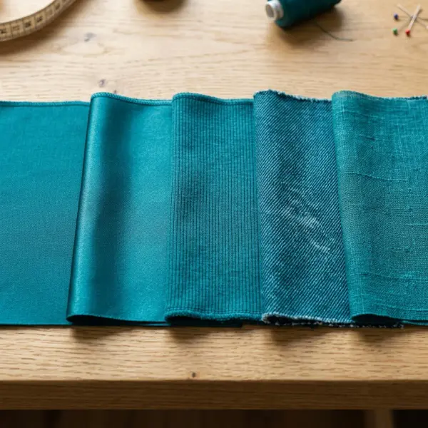
For fashion businesses, this means color decisions should not stop at mood boards. A color that looks beautiful in a digital palette must be tested as lab dips, fabric swatches, sample garments, and product photography. Everyday styling depends on how the garment appears in real conditions, not only how the color looks in a forecast report.
Color Trends and Wardrobe Psychology: Useful, But Not Universal
Color can influence how clothing is perceived, but color psychology should be used carefully. Research on apparel and color psychology suggests that color associations can affect consumer perception, yet interpretation varies by culture, belief, personal experience, and market context.
This matters because fashion advice often oversimplifies color: red is confident, blue is trustworthy, black is slimming, white is pure, green is natural. These associations may be familiar in many markets, but they are not universal rules. A color that feels elegant in one context may feel ceremonial, youthful, political, religious, or inappropriate in another.
For everyday styling, color works best when it supports the wearer’s context. A bright red outfit may be perfect for a festive event, campaign image, or confident personal style. It may not be ideal for a conservative office or a customer who prefers quiet dressing. A soft white dress may look premium in a resort setting but impractical for commuting, food service, childcare, or a rainy climate.
Fashion businesses should treat color psychology as one input, not a magic formula. Strong color strategy combines customer research, sales data, climate, cultural context, garment category, price point, and styling education.
How Climate and Season Affect Color Wearability
Seasonal color direction affects everyday styling because weather changes how people dress, shop, and perceive comfort. A 2025 study using more than 3.18 million transactions across 99 physical fashion retail stores in Italy found that higher temperature and relative humidity were associated with consumer preference for cooler clothing colors, while increased wind speed encouraged warmer color selection; the study also found that fashion trends moderated the relationship between weather and color preference.
That finding should not be applied blindly to every market, but it supports an important retail reality: color is not separate from climate. A palette that sells well in a cool urban market may not behave the same way in a humid tropical city. A black-heavy collection may look sophisticated online but feel less appealing for daytime wear in hot weather. A pale palette may feel fresh in summer but less practical in rainy months.
For everyday styling, seasonal color use can be simplified:
- Warm weather often supports lighter, cooler, fresher, or brighter shades, depending on market taste.
- Cooler weather often supports deeper, warmer, earthier, or richer shades.
- Transitional seasons benefit from bridge colors such as olive, denim blue, chocolate brown, cream, taupe, and muted teal.
- Humid climates may need color choices that still look fresh after movement, sweat, and frequent washing.
- Urban wardrobes often need colors that work across office, commute, social life, and online visibility.
For brands selling internationally, this is one reason global color trends need local editing. A Spring/Summer palette from a runway capital may inspire direction, but merchandising teams still need to adapt it to climate, consumer routine, and product category.
Practical Color Styling Framework for Fashion Brands
Fashion businesses can apply color trends more effectively by building a structured color framework instead of reacting to every new shade. The framework should connect trend direction with wardrobe logic, production capability, and retail communication.
A useful approach is to divide the palette into four layers: foundation, seasonal update, emotional accent, and commercial test.
|
Palette Layer |
Purpose |
Example |
Best Product Use |
|
Foundation colors |
Maintain wardrobe continuity |
Black, navy, denim, cream, beige, brown |
Best-sellers, trousers, jackets, basics |
|
Seasonal update colors |
Make the collection feel current |
Sage green, teal, pale blue, soft white |
Tops, dresses, knitwear, soft tailoring |
|
Emotional accent colors |
Add energy and campaign appeal |
Tomato red, citrus yellow, turquoise, pink |
Accessories, hero pieces, capsules |
|
Commercial test colors |
Explore new demand with limited risk |
Purple, chartreuse, unusual brights |
Small drops, online exclusives, styling edits |
This framework helps brands avoid overcommitting to colors that are visually exciting but commercially uncertain. It also helps merchandising teams style collections more coherently. A customer should understand how the colors work together across product pages, lookbooks, store displays, email campaigns, and social media.
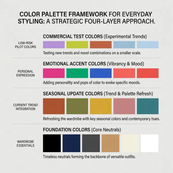
For brands developing content, this framework can also support internal linking and topical authority. A styling article can explain how customers wear the color, while a deeper business article can discuss how color palettes influence fashion buying decisions, and a forecasting article can explain why color forecasting matters in fashion and lifestyle trends.
Applying Color Trends Across Product Categories
Color behaves differently depending on product category. A dramatic shade may sell well in accessories but perform poorly in trousers. A soft neutral may work beautifully in dresses but require better lining and opacity. A bold color may be perfect for activewear, swimwear, or occasionwear, but too strong for everyday office basics.
Tops and Blouses
Tops are one of the easiest categories for color experimentation because they sit near the face and can refresh existing bottoms. Teal, pale blue, soft pink, tomato red, sage, cream, and light yellow can all work as seasonal updates when styled with denim, tailored trousers, or skirts.
For brands, tops allow faster testing because consumers often buy them as wardrobe refresh items. The risk is fit and fabric. A strong color will not compensate for poor drape, thin material, or uncomfortable construction.
Dresses
Dresses carry color more visibly because they cover a larger body area. A trend color in a dress can create a strong impression, which is useful for campaign visuals, resortwear, occasionwear, and social dressing. But it also raises the customer’s commitment level.
A teal dress may feel elegant and wearable. A full lime dress may appeal to trend-driven shoppers but require more careful styling. A soft white dress may look premium but needs opacity, lining, and practical care guidance.
Trousers and Bottoms
Bottoms are usually safer in core or grounded colors because customers need them to coordinate with multiple tops. Olive, navy, denim, chocolate brown, cream, charcoal, and beige tend to be more versatile than bright trend shades.
That does not mean colored trousers cannot work. It means the color must match the customer’s confidence level and wardrobe habits. Wide-leg red trousers can be powerful for a fashion-forward audience. For a broader market, red may perform better as a top or accessory.
Outerwear
Outerwear can carry strong seasonal identity because it is highly visible. A sage trench, teal blazer, cream jacket, or chocolate coat can make a collection feel current while staying wearable. Very bright outerwear can work for statement brands, but it may limit repeat wear for practical customers.
Accessories
Accessories are the lowest-friction way to introduce color trends. Bags, scarves, belts, shoes, socks, hair accessories, and jewelry accents can help customers test a color before buying a full garment. For retail teams, accessories can also connect color stories across departments.
This is where visual merchandising strategies for fashion retail becomes important. A colored bag displayed next to neutral clothing can teach the customer how to wear the shade without requiring a long explanation.
Common Mistakes When Using Fashion Color Trends
Color trend mistakes usually happen when brands mistake visibility for wearability. A color can look powerful in a runway image or forecast board but still fail in everyday styling if the customer cannot connect it to real outfits.
Mistake 1: Treating Every Trend Color as a Best-Seller
Not every trend color deserves high production volume. Some colors are better for editorial imagery, small capsules, accessories, or limited drops. Producing a high-volume trouser, blazer, or dress in a difficult color can create unnecessary markdown risk.
A better approach is to test difficult colors in lower-risk categories first. If the customer responds well, the brand can expand the color into larger garments or repeat it in the next collection.
Mistake 2: Ignoring Existing Wardrobe Anchors
Customers rarely style a new purchase in isolation. They combine it with what they already own. If a brand introduces a strong color but does not show how it works with denim, black, white, beige, navy, brown, or grey, the customer has to do the styling work alone.
Product pages should show trend colors with realistic wardrobe anchors. This is especially important for AI search, visual search, and product discovery, where clear styling context can help both users and systems understand the garment’s use case.
Mistake 3: Choosing Colors That Do Not Match the Material
Some colors need structure. Some need fluidity. Some need matte texture. Some need sheen. A color that looks refined in wool suiting may look cheap in thin polyester. A pastel that looks elegant in cotton poplin may look washed out in low-quality jersey.
Brands should evaluate color together with fabric, not after fabric selection. The best color decision is often a color-material decision.
Mistake 4: Using Forecasts Without Local Editing
Global trend reports are useful, but they are not a substitute for market understanding. A shade that works in London street style may need adjustment for Jakarta, Dubai, Seoul, Milan, Los Angeles, or São Paulo. Climate, skin tone diversity, religious norms, workwear expectations, modesty preferences, and laundry habits can all affect color adoption.
Forecasts should inspire direction. Local merchandising should decide execution.
Mistake 5: Overloading the Collection With Too Many Colors
Too many colors can make a collection harder to merchandise. Retail displays become messy, production minimums become fragmented, and customers struggle to understand the brand’s visual story.
A tighter palette usually performs better for everyday styling. It gives customers enough choice without making the collection feel random.
What Brands Should Verify Before Acting on a Color Trend
Before adopting a fashion color trend, brands should verify whether the color works commercially, technically, and visually. A color should not be approved only because it appears in a trend report or looks attractive in a digital mood board.
The most important checks include:
- Does the color match the brand’s customer profile and price positioning?
- Does it work with the customer’s existing wardrobe colors?
- Does it suit the fabric, finish, opacity, and garment category?
- Can suppliers achieve consistent lab dips and bulk production?
- Does the color look acceptable under daylight, store lighting, and photography lighting?
- Does it create unnecessary care, staining, fading, or quality-control issues?
- Does it support the brand’s campaign, retail display, and online product grid?
- Can the color be explained simply in styling content?
These checks are not only for large brands. Small brands need them even more because a poor color decision can tie up cash in slow-moving inventory.

How to Communicate Color Trends to Everyday Customers
Customers do not always think in trend language. They think in situations: What can I wear to work? What looks fresh with jeans? What color makes my outfit less boring? What can I pack for a trip? What shade is easy to repeat?
This is where styling communication matters. Instead of saying “teal is trending,” a product page can say “wear this teal blouse with navy trousers for work or with cream denim for a weekend look.” Instead of saying “red is the color of the season,” a brand can show a red cardigan layered over a white tank and straight-leg jeans.
Practical color communication should include:
- Outfit use cases, such as work, weekend, travel, resort, casual dinner, or daily errands.
- Pairing suggestions with common wardrobe colors.
- Fabric and care notes when the color is light, bright, or delicate.
- Product photography on different skin tones where possible.
- Simple styling edits for conservative and expressive customers.
- Cross-sell links to matching neutrals or accessories.
This also supports fashion merchandising explained for retail businesses, because color is not only a design decision. It affects how products are grouped, displayed, photographed, named, described, and sold.
FAQ: Fashion Color Trends and Everyday Styling
What are fashion color trends in simple terms?
Fashion color trends are the colors and color combinations that become visually influential in clothing, accessories, retail displays, runway collections, and everyday outfits during a certain season or period. They can include bold shades, soft neutrals, earthy tones, pastels, metallics, or specific color pairings. For everyday styling, color trends are most useful when they help customers refresh clothes they already understand, such as shirts, dresses, knitwear, denim, tailoring, or accessories.
Do customers need to follow every color trend?
No. Everyday styling works better when customers select the color trends that suit their wardrobe, lifestyle, climate, and personal comfort. A customer who prefers quiet dressing may use a trend through soft white, sage, pale blue, or chocolate brown. A more expressive customer may try tomato red, turquoise, purple, or lime. The most wearable approach is usually to combine one trend color with familiar wardrobe anchors.
What is the safest way for a brand to introduce a bold color?
The safest way is to introduce bold color through lower-risk categories such as tops, accessories, small capsules, styling edits, or online exclusives before expanding into high-volume products. A bright color in a scarf, bag, cardigan, or blouse is easier for customers to adopt than a full suit or trouser. Brands should also show realistic outfit pairings so customers understand how to wear the color.
Are neutral colors still important when bright colors are trending?
Yes. Neutral colors remain important because they make trend colors wearable. Black, white, cream, beige, navy, grey, brown, olive, and denim tones help customers style brighter shades without feeling overdone. For brands, neutrals also stabilize assortments and reduce inventory risk. Bright colors create attention, but neutrals often support repeat wear, cross-selling, and long-term wardrobe use.
Why does the same color look different on different garments?
The same color can look different because fabric fiber, weave, texture, sheen, dye method, garment construction, and lighting affect color appearance. A teal satin dress may look richer than a teal cotton shirt. A pale yellow may look crisp in poplin but weak in thin jersey. This is why brands should review lab dips, fabric swatches, sample garments, and photography before approving a color for production.
How can small fashion brands use color trends without taking too much risk?
Small brands can use color trends by keeping their core assortment stable and adding seasonal color in controlled quantities. For example, they can keep best-selling trousers in black, navy, or beige, then introduce trend colors through tops, dresses, scarves, or limited drops. They should also track customer response, return reasons, sell-through, and social engagement before increasing production.
What is the difference between color trends and color forecasting?
Color trends describe colors currently gaining visibility or commercial relevance. Color forecasting tries to anticipate future color direction before the market fully adopts it. Everyday styling uses current or near-current color trends to help customers dress better now. Forecasting is more strategic for product development, sourcing, and long-lead collection planning, which is explored more deeply in the article on why color forecasting matters.
Conclusion
Fashion color trends are most useful when they are translated into real wardrobe behavior. A trend color does not need to dominate an outfit to be effective. It can appear as a blouse under a blazer, a cardigan with denim, a soft white dress for summer, a teal accessory with neutrals, or a sage jacket that makes everyday basics feel more current.
For fashion businesses, the strongest color strategy balances freshness with wearability. Trend colors should not be copied blindly from runway reports or forecasting agencies. They need to be tested against customer lifestyle, fabric performance, climate, production consistency, styling clarity, and retail presentation.
Color is one of fashion’s simplest visual tools, but it is not a simple business decision. The brands that use it well are not just chasing the newest shade. They are building palettes that customers can understand, wear, repeat, and remember.




Comments 0
Leave a CommentSend Comment
Anda harus Login terlebih dahulu untuk dapat memberikan komentar.