
Why Color Forecasting Matters in Fashion and Lifestyle Trends
Quick Answer
Color forecasting matters because fashion and lifestyle products are planned long before customers see them in stores, online shops, campaigns, or social media. A color forecast helps brands anticipate which shades, color families, finishes, and palette moods may become relevant in future seasons, so product teams can make better decisions about fabrics, dyes, trims, packaging, merchandising, and campaign direction.
Color forecasting is not a guarantee that one color will become a bestseller. It is a strategic planning tool. Strong forecasting combines cultural observation, consumer behavior, design signals, material innovation, retail movement, regional context, and commercial judgment. Forecasting agencies such as WGSN describe their work as combining expert trend forecasting with data science, while organizations such as Color Marketing Group emphasize global networks of color professionals and collaborative forecast development. WGSN trend forecasting and analytics|Color Marketing Group color forecasting
For fashion businesses, the value is practical: forecasting helps reduce late decision-making, improve collection coherence, align suppliers earlier, manage inventory risk, and connect fashion products with broader lifestyle moods.

What Is Color Forecasting?
Color forecasting is the process of anticipating future color directions, combinations, finishes, and palette moods based on cultural, social, design, retail, consumer, and material signals, so businesses can plan products and visual strategies before the market fully shifts.
In fashion, color forecasting sits earlier than styling and merchandising. A stylist may ask, “How can customers wear this color now?” A merchandiser may ask, “Will this seasonal palette help customers buy?” A forecaster asks a different question: “Which color directions are likely to matter next, and why?”
That difference is important. Forecasting is not simply choosing attractive colors. It is a structured interpretation of change. A forecast may consider runway direction, art and design movements, technology, wellness culture, sustainability narratives, youth culture, economic mood, travel behavior, interiors, beauty, automotive design, digital aesthetics, and retail performance. The best forecasts do not treat color as isolated decoration. They connect color to how people want to feel, what they want to signal, and what kinds of products they are likely to adopt.
ScienceDirect’s overview defines colour forecasting as predicting future colour trends and combinations based on trend research, intuition, and creative thinking, often looking at colors, finishes, materials, and designs two to three years ahead. ScienceDirect overview of color forecasting In fashion business practice, the time horizon may vary. Some brands work one season ahead; textile mills, large retailers, and lifestyle brands often need longer planning windows.
Why Fashion Cannot Treat Color as a Last-Minute Choice
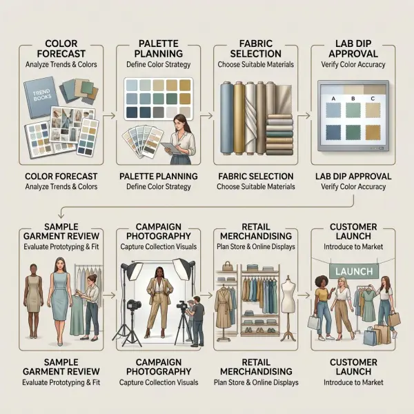
Color decisions affect more than the final look of a garment. They influence fabric sourcing, dyeing, trims, lab dips, sampling, photography, merchandising, packaging, content direction, and inventory depth. When color is decided too late, the collection may still look attractive on paper, but the business process becomes less controlled.
A garment color has to move through many operational steps before it reaches the customer. Fabric mills may need to develop dye recipes. Suppliers may need to submit lab dips. Trims, linings, zippers, buttons, embroidery thread, labels, and prints may need to coordinate. Product photography must represent the shade accurately. Retail teams need to build a coherent display or product grid.
That is why forecasting matters. It gives teams time.
A brand that knows teal, soft white, warm brown, or luminous blue may become strategically important can begin testing those color families early. It can check whether the shade works in cotton, satin, denim, knitwear, synthetic blends, recycled polyester, leather alternatives, or packaging. It can also decide whether the color belongs in a hero product, a limited capsule, a basic line, an accessory program, or only a campaign visual.
For smaller brands, forecasting does not need to mean buying expensive reports. It can mean building a disciplined habit of tracking color signals before competitors react: customer comments, competitor assortments, runway repetition, fabric supplier offerings, search trends, social media styling patterns, and sell-through by color.
Color Forecasting vs Color Trends: What Is the Difference?
Color forecasting looks forward. Color trends describe what is already visible or gaining traction now. They overlap, but they are not the same.
A color trend may appear on runways, in street style, on product pages, or across social media. A forecast tries to interpret what might come next and why. Forecasting is more useful for product development, sourcing, and long-lead planning. Trend observation is more useful for current styling, merchandising, and marketing content.
|
Concept |
Main Question |
Time Horizon |
Business Use |
|
Color forecasting |
Which color directions may matter next? |
Future season or multi-season |
Product development, sourcing, strategic planning |
|
Color trend tracking |
Which colors are visible now? |
Current or near-current |
Styling, merchandising, campaign updates |
|
Seasonal palette planning |
Which colors should define this collection? |
Specific selling season |
Buying, assortment, retail execution |
|
Color performance analysis |
Which colors actually sold? |
Past and current sales period |
Reordering, markdown control, future planning |
This distinction prevents a common mistake: using a current trend as if it were a future forecast. By the time a color becomes highly visible to consumers, some product categories may already be late to market. That is especially true for brands with long development cycles, fabric minimums, overseas production, or complex retail calendars.
For a more current-season explanation, see fashion color trends explained for everyday styling. For the buying behavior angle, see how seasonal color palettes influence consumer buying decisions.
How Forecasting Agencies Signal Future Color Direction
Forecasting agencies and color organizations often publish future-facing color stories before the market fully adopts them. These reports are not instructions for every brand to use the same shade. They are directional signals that businesses interpret according to category, customer, region, and brand identity.
For example, WGSN and Coloro announced Luminous Blue as their 2027 Colour of the Year and named S/S 27 key colors including Luminous Blue, Energy Orange, Pop Pink, Meadowland Green, and Clay. WGSN and Coloro Colour of the Year 2027 Coloro’s own key-color page frames the 2027 palette around interconnectedness and the relationship between nature and technology. Coloro S/S 27 key colors
Pantone, meanwhile, selected Cloud Dancer as its 2026 Color of the Year, positioning the soft white hue as a color associated with calm, clarity, and a kind of visual reset. Pantone Color of the Year 2026 Cloud Dancer
These examples show an important reality: different forecasting authorities may emphasize different signals. One may highlight blue as a forward-looking color, while another highlights white as a cultural reset. That does not mean one is right and the other is wrong. It means color direction is plural. Fashion businesses need interpretation, not blind adoption.
Why Color Forecasting Matters for Product Development
Color forecasting matters in product development because fabric, silhouette, finish, and shade need to work together. A forecasted color may be commercially useful in one material and weak in another.
A luminous blue may work well in activewear, digital-first campaigns, accessories, resortwear, or technical outerwear. The same blue may be difficult in formal suiting if the customer expects conservative office colors. A soft white may look premium in shirting, tailoring, resortwear, home textiles, or bridal-adjacent styling, but it may create opacity, staining, and care challenges in thin everyday garments.
A forecast gives product teams time to ask the right questions:
- Should this color be used as a hero shade, supporting shade, or accent?
- Does it work best in woven fabric, knitwear, denim, satin, linen, leather goods, or packaging?
- Is the customer likely to wear it close to the face, as a full garment, or only as an accessory?
- Does the color need matte texture, sheen, transparency, structure, or softness?
- Can the supplier match the color consistently across fabric and trims?
- Does the shade remain attractive under store lighting and natural daylight?
The earlier these questions are asked, the better the final product usually becomes. Color forecasting is valuable because it turns color from a late styling decision into an integrated product decision.

Why Color Forecasting Matters for Sourcing and Production
Color forecasting also matters because color is operational. It has to be produced, repeated, inspected, and controlled.
Textile color is not only a visual choice. It involves dye chemistry, substrate behavior, finishing, lighting conditions, and quality-control standards. AATCC describes its textile test methods and procedures as international standards cited in industry, government, and company specifications worldwide. AATCC textile testing and standards For brands, this means color decisions eventually need technical validation, not only creative approval.
A major issue is metamerism, where two materials appear to match under one light source but look different under another. Datacolor explains metamerism as the situation where objects match under one lighting condition but differ under another because of spectral reflectance differences. Datacolor explanation of metamerism HunterLab also notes that textile color matching can face challenges from illuminant metamerism, which can affect shade matching and quality control. HunterLab color matching challenges in textiles
This is where forecasting connects to production reality. If a brand expects a color family to become important, it can begin supplier conversations earlier. It can request swatches, test dye lots, review trims, and decide whether the shade is feasible at the required price point and quality level.
Late color decisions often create rushed approvals. Rushed approvals can create avoidable problems: mismatched trims, inconsistent bulk fabric, photography disputes, quality rejection, delivery delays, or markdown risk because the final shade does not match the intended story.
Why Color Forecasting Matters Beyond Fashion
Color forecasting matters beyond fashion because color direction often moves across lifestyle categories. A shade may appear in apparel, interiors, beauty, footwear, accessories, packaging, consumer electronics, automotive finishes, digital branding, hospitality design, and wellness products.
This cross-category movement matters because consumers do not experience fashion in isolation. A customer may see a soft white in interiors, a luminous blue in digital design, a clay tone in homeware, or a pop pink in beauty packaging before they buy similar color moods in clothing. Lifestyle culture creates repeated visual exposure. Repeated exposure can make a color feel familiar, desirable, or “right” for a moment.
Color Marketing Group positions itself as an international association for color design professionals and describes its forecasting work as connecting a global network of color experts. Color Marketing Group about CMG This cross-disciplinary structure reflects how color decisions are not limited to fashion design. Color travels through many industries before it settles into consumer taste.

For fashion brands, this creates opportunity. A color that is already gaining strength in home, beauty, or digital culture may feel more acceptable when it reaches apparel. It also creates risk. If a color becomes overexposed across too many categories, it may lose freshness faster.
How Forecasting Supports Brand Identity
A strong brand should not adopt every forecasted color. Forecasting matters because it helps brands choose which future signals fit their identity—and which do not.
A minimalist brand may interpret a vivid forecast through subtle accents, soft contrast, or refined neutrals. A youth-focused streetwear label may use the same forecast through stronger saturation and graphic combinations. A modest fashion brand may use future colors in longer silhouettes, layered styling, or more restrained combinations. A luxury accessories brand may translate a color direction into leather, hardware, lining, or packaging rather than full apparel.
The goal is not to look like everyone else. The goal is to stay culturally relevant without losing visual consistency.
A brand that chases every forecast may become visually unstable. Customers may struggle to recognize it from season to season. A brand that ignores future signals completely may begin to feel dated, especially in categories where color freshness matters: dresses, accessories, resortwear, activewear, youth fashion, beauty-adjacent fashion, and lifestyle retail.
Good color forecasting supports brand discipline. It helps a business say both yes and no with confidence.
How Forecasting Helps Reduce Inventory Risk
Color forecasting can reduce inventory risk when it is used with commercial discipline. It does not eliminate risk. It helps teams make earlier, more structured decisions about which colors deserve depth and which should be tested lightly.
The risk is not only choosing the wrong color. It is choosing the wrong volume, wrong product category, wrong timing, or wrong market. A forecasted color may be excellent for campaign visibility but unsuitable for high-volume trousers. Another color may be too quiet for a hero campaign but perfect for replenishment basics.
A practical color risk framework might look like this:
|
Forecast Signal |
Recommended Business Response |
Risk Control |
|
Strong forecast + strong customer history |
Use in higher-volume categories |
Monitor sell-through and replenishment |
|
Strong forecast + weak customer history |
Test in selected styles |
Limit depth and support with styling content |
|
Weak forecast + strong customer demand |
Continue as commercial core |
Avoid removing too quickly |
|
Strong social visibility + uncertain wearability |
Use in accessories or capsules |
Avoid large inventory commitment |
|
Strong lifestyle signal + unclear apparel adoption |
Test through content and small drops |
Validate before full collection rollout |
This type of thinking is especially useful for small and mid-sized fashion businesses. A large brand may absorb a wrong color decision more easily. A smaller brand may have cash tied up in one underperforming shade for months.
Forecasting works best when paired with sell-through data, customer feedback, regional knowledge, and production constraints. It is not a replacement for business judgment.
What a Good Fashion Color Forecast Should Include
A useful color forecast should explain the reason behind the color direction, not only show a beautiful palette. Without context, a palette is just decoration. With context, it becomes a planning tool.
A strong forecast usually includes:
- Color story: the emotional and cultural reason behind the palette.
- Key colors: the main shades expected to gain relevance.
- Supporting neutrals: grounding colors that make the palette wearable.
- Material direction: whether the colors work best in matte, glossy, textured, sheer, compact, or soft surfaces.
- Category relevance: where the colors may work best, such as apparel, accessories, beauty, interiors, or activewear.
- Regional notes: how adoption may vary by market or climate.
- Commercial risk level: which colors are safer, more experimental, or category-specific.
- Styling or merchandising implications: how the palette can be shown to customers.
The most useful forecasts give teams a way to think, not only a list of colors to copy. They explain why a color may matter and where it may fail.
How Fashion Businesses Can Apply Color Forecasting
Fashion businesses can apply color forecasting by turning broad direction into practical product decisions. The process should be structured enough for business planning but flexible enough to preserve creativity.
Start With the Brand’s Color DNA
Before reading any forecast, a brand should know its own color DNA. This includes recurring neutrals, signature colors, customer-safe shades, best-selling color families, and colors that consistently underperform.
A forecast is useful only when filtered through this identity. If a brand is known for quiet tailoring, a future pop pink direction may become a lining, scarf, shirt stripe, campaign accent, or limited blouse—not necessarily a full suit. If a brand is known for expressive resortwear, the same color may become a hero dress.
Separate Inspiration From Commitment
Not every forecasted color deserves production commitment. Some colors are useful for mood boards, content direction, photoshoot styling, packaging accents, or test products. Others deserve serious fabric development and buying depth.
Teams should separate colors into roles:
- Core continuation colors.
- Future seasonal updates.
- Experimental accents.
- Campaign-only colors.
- Supplier development colors.
- Colors to watch but not yet produce.
This separation prevents trend enthusiasm from becoming inventory pressure.
Connect Forecasting With Fabric Development
Color should be tested in the actual materials the brand plans to use. A forecasted soft white may need opacity testing. A luminous blue may need shade consistency across synthetic and natural fibers. A clay tone may look refined in suede or cotton twill but dull in thin jersey.
Forecasting should lead to swatch requests, lab dip review, trim matching, and sample testing—not only visual inspiration.

Use Small Drops to Validate Riskier Colors
Riskier colors can be tested through small drops, limited capsules, accessories, pre-orders, digital campaigns, or styling content before being expanded. This is especially useful for brands with limited production budgets.
A color that performs well in engagement but poorly in purchase data may be visually appealing but not commercially ready. A color that quietly sells through without much campaign attention may deserve deeper investment.
Review Forecast Accuracy After the Season
Forecasting improves when teams review outcomes. After each season, brands should compare forecast assumptions with actual customer response. Which colors sold at full price? Which needed discounts? Which got attention but low conversion? Which were returned due to color mismatch? Which colors performed differently by region, size range, or product category?
This review turns forecasting from external inspiration into internal knowledge.
Common Mistakes in Color Forecasting
Color forecasting becomes risky when businesses use it as prediction rather than interpretation. The strongest teams use forecasts as structured intelligence. Weaker teams use them as instructions.
Mistake 1: Copying a Forecast Without Editing It
A forecasted palette may be globally influential, but it still needs editing for brand, category, region, and customer. A color that works in premium accessories may not work in daily basics. A color that feels fresh in a European winter collection may need a lighter material or different timing in a tropical market.
The better approach is translation. Keep the signal, adjust the execution.
Mistake 2: Treating One Color of the Year as the Whole Trend
Color of the Year announcements are useful cultural signals, but they are not complete seasonal strategies. Pantone’s Cloud Dancer, WGSN and Coloro’s Luminous Blue, or any other named color should be understood as part of a wider conversation, not a universal instruction.
A brand should ask: Does this color fit our customer? Which product categories make sense? Should it be a main shade, accent, neutral, packaging cue, or content mood?
Mistake 3: Ignoring Technical Feasibility
Some colors are difficult to reproduce consistently across materials. Some fade faster, show defects more clearly, require better fabric quality, or look different under varied lighting. Forecasting without technical validation can create production problems later.
Color approval should include lab dips, material testing, trim matching, and visual checks across lighting conditions.
Mistake 4: Confusing Social Media Visibility With Long-Term Demand
A color can go viral quickly and fade just as quickly. Social media visibility can be useful, but it is often strongest for visual novelty. Long-term demand depends on wearability, price, category, customer lifestyle, and repeat use.
Fashion businesses should be careful about committing too much production volume to colors that are only supported by short-term visual buzz.
Mistake 5: Using Forecasting Without Sales Data
Forecasting tells a brand what may become important. Sales data tells a brand what its own customers actually bought. Both matter.
A forecast may say a color family is rising, but if the brand’s customer repeatedly avoids that color, the better move may be a softer version, accessory placement, or content test—not a large production run.
What Brands Should Verify Before Acting on a Color Forecast
Before acting on a color forecast, fashion businesses should verify whether the forecasted color direction is suitable for their product, customer, and operational reality.
Important checks include:
- Does the color direction fit the brand’s visual identity?
- Does the customer already show interest in related colors?
- Is the color appropriate for the target climate, occasion, and retail calendar?
- Which product categories can carry the color with acceptable risk?
- Can suppliers reproduce the color consistently across fabric, trims, and bulk production?
- Does the color need special care guidance, lining, opacity checks, or fade testing?
- Will it photograph accurately for e-commerce and campaigns?
- Can the color transition across seasons, or is it tied to a short selling window?
- Is the color commercially scalable, or should it remain a limited test?
- How will the brand measure whether the forecast decision was successful?
These checks keep forecasting practical. A beautiful forecast becomes valuable only when it survives product development, sourcing, retail execution, and customer response.
FAQ: Color Forecasting in Fashion and Lifestyle Trends
What is color forecasting in fashion?
Color forecasting in fashion is the process of predicting future color directions and palette moods so brands can plan collections before customers see them in the market. It uses cultural signals, design movement, consumer behavior, lifestyle trends, materials, retail observations, and commercial interpretation. The goal is not to guess one winning color perfectly. The goal is to help product, sourcing, merchandising, and marketing teams make earlier and more informed decisions.
Why is color forecasting important for fashion brands?
Color forecasting is important because fashion products often need long planning timelines. Brands must choose fabrics, develop samples, approve colors, coordinate trims, shoot campaigns, and prepare retail stories before launch. Forecasting gives teams a future-facing direction, reducing rushed decisions. It can also help brands build more coherent palettes, manage inventory risk, and connect products with broader cultural and lifestyle moods.
Is color forecasting always accurate?
No. Color forecasting is not always accurate, and it should not be treated as certainty. It is an informed prediction based on available signals. A forecast may identify a strong direction, but commercial success still depends on customer profile, climate, product category, pricing, styling, fabric quality, and retail execution. The best brands use forecasts as guidance, then validate decisions through testing, sales data, and customer feedback.
How far ahead do color forecasts look?
Many color forecasts look one to three years ahead, especially for industries with long development cycles such as textiles, interiors, automotive, and large-scale fashion retail. Some fashion brands work with shorter horizons depending on their speed, supplier network, and business model. Fast-moving brands may react closer to market, while mills, large retailers, and lifestyle companies often need earlier direction.
What is the difference between color forecasting and trend reporting?
Color forecasting anticipates future color directions before they fully reach the market. Trend reporting describes colors already visible in runway collections, retail assortments, street style, social media, or consumer products. Forecasting helps with early product development and sourcing. Trend reporting helps with current styling, merchandising, content, and marketing decisions. Both are useful, but they serve different stages of the fashion calendar.
Can small fashion brands use color forecasting?
Yes. Small brands can use color forecasting without relying only on expensive reports. They can track customer purchases by color, observe competitor palettes, review supplier swatches, follow runway and lifestyle signals, monitor search behavior, and test risky shades through limited drops. The key is not to copy every forecast. The key is to identify which future color signals fit the brand’s customer and production capacity.
Why does color forecasting matter in lifestyle trends, not only fashion?
Color forecasting matters in lifestyle trends because consumers experience color across many categories: clothing, beauty, interiors, packaging, electronics, hospitality, and digital media. A color that gains visibility in home design or beauty may make consumers more receptive to it in fashion. Cross-category exposure can strengthen a color mood, but it can also create overexposure if brands adopt it without originality.
How should brands measure whether a forecasted color worked?
Brands should measure forecast success through sell-through by color, full-price sales, return reasons, markdown rates, customer feedback, product page conversion, regional performance, and repeat demand. Social media engagement is useful but not enough. A color may attract attention without producing profitable sales. The strongest review compares the original forecast assumption with actual commercial behavior.
Conclusion
Color forecasting matters because fashion and lifestyle products are built before the market fully reveals what it wants. A good forecast helps brands prepare earlier, think more clearly, and connect product decisions with wider cultural and consumer movement.
But forecasting is not fortune-telling. It is disciplined interpretation. A forecasted color becomes valuable only when a brand translates it through customer understanding, product category, fabric behavior, supplier capability, local market context, and commercial testing.
For fashion businesses, the opportunity is not to chase every future shade. The opportunity is to build a sharper color decision system: observe early signals, choose what fits the brand, test carefully, produce with technical control, communicate clearly, and review results honestly.
The brands that use color forecasting well do not simply look more current. They make better decisions before the rest of the market catches up.




Comments 0
Leave a CommentSend Comment
Anda harus Login terlebih dahulu untuk dapat memberikan komentar.